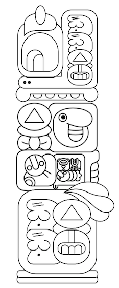
jan Same has made a complete translation of Little Red Riding Hood, and it’s fantastic, both in effort and in results. He spent two years on the project, enlisted the help of jan Kipo, jan Lope and jan Tepan for the translation and has presented three versions: toki pona, sitelen sitelen, and sitelen pona.
If you are looking for a good way to practice your toki pona, or reading sitelen sitelen, this is it. He’s linked to the original English text, so you can look at the English and toki pona side by side, or the toki pona and sitelen and find examples of just about any grammatical structure you might come across.
It’s worth going to his page to see the original, but I just want to point out a couple things I love about his layout, in particular the use of attributes in the dialogue, and the nesting of components.
Attributes
Here is an example of how he’s handled the attributes:

The meli lili: and soweli ike: are small enough to not be distracting, but still manage to clearly mark out the dialog as it passes between little red riding hood and the wolf.
I remember struggling with how to do this ten years ago when sketching out the kulupu mama Jine pieces. Seeing this solution in this context makes me really like this structure and the proportions jan Same used.
Nesting
Finding the right size to comfortably nest in sitelen sitelen is always the heart of the challenge, and here I think jan Same really shined. Take this rather complex sentence for example, (from the related story at the end of the tale, which tells of another time red riding hood meets a wolf on the road and tells her grandmother about it):
lon tomo pi mama mama ona la meli lili li toki e ijo pi soweli ike sin tawa mama mama meli ona.

By the time we get to soweli ike sin we are nested in both an e and an pi, and sandwiched between the main sentence and a prepositional block. And yet no glyph feels so large that it gets undue attention, or so small that it is illegible.